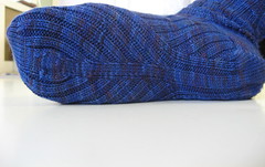
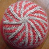
and now for something completely different (depending on what you mean by completely and different)
Sparse post today, as they all will probably be until next week. (It's been a frustrating and busy day, and it's not even 3 yet. I've spent most of it on the phone with my insurance company, or crying because I was so frustrated, inbetween calls. I'll stop before this becomes a TMI post, but rest assured I probably won't die. Yet. ;-)
I ordered yarn yesterday! I decided to go with a sweater that I didn't even mention in yesterday's post. It's the Fair Isle Pullover with Vertical Stripes, designed by Jane Hill. A very interesting design, that has both traditional and non-traditional elements. The main motif is worked in a mirror image, and the knitter has to take the very sparse instructions in the pattern, combine them with the chart, and make it work. I worked it out yesterday, and it was a fun little exercise. I think this pattern is a bit uncharacteristic for the book, in that most of the patterns seem to be very complete in terms of directions. This one leaves it up to the knitter to figure out the details of how to use the chart, and how to properly line the whole thing up.
I'm going with a completely different colorway. I wish there were a picture of the sweater out there somewhere, but as I've come to expect, I haven't found any pictures of this sweater other than the ones in the book in front of me. Maybe I'll photo the photo later. The colorway in the book is a background of dark blue, with the main motif (faux-snowflakes, plus some vertical bars) in shades of blue, purple, and pink. I'm not wild about that colorway, and although I bet I'd love it if I saw it in person, in the original J&S, there's no way I could put something together with Palette that isn't gaudy. I'm going for a cream background, with the foreground motif in shades of blue, with a light purple to mix in with the blues, and a dark brown as the middle stripe in each pattern repeat. It will be sandwiched between rows of the darker blue, so it will be about as saturated a color, but just a bit of a difference to add some visual interest. I like the colors together based on playing around with the color card. I hope I'll like them in the sweater. And the faux-snowflake motif is really gorgeous and delicate. You can barely tell what it is in the book photos. I think a light background with less frenetic foreground colors will make it easier to see the motif.
The pattern as written is too big for me, but it's written for 7.5 stitches and 8 rows per inch. I think if I tighten it up to 8 stitches and 8.5ish rows per inch, it will be a great fit for me.
That turned out a little longer, and perhaps a little more interesting than I intended. Good, I guess? I also have a potential new project up my sleeves, which will probably make for interesting blogging, with pretty pictures. I'll probably start it when I finish one or both of the Jaywalker socks. So if you could care less about fair isle, or my blatherings about what I'm going to knit for the KAL, stick around.


0 Comments:
Post a Comment
<< Home